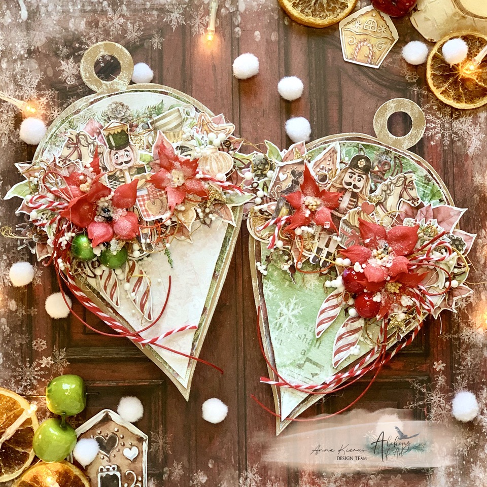


Witajcie!
Tworząc te kartki z kolekcji Art, bawiłam się kolorem i charakterem grafik.
Z jednej strony energetyczna czerwień, która przyciąga wzrok i dodaje projektowi wyrazistości. Z drugiej głęboka butelkowa zieleń, wprowadzająca nutę elegancji i spokoju.
Kolekcja Art zachwyciła mnie nie tylko paletą kolorów, ale również niezwykle inspirującymi grafikami. Artystyczna dziewczyna otoczona farbami i pędzlami, delikatny motyl, vintage'owe dodatki i wiele innych tworzą gotową bazę do budowania wyjątkowych kompozycji.
To właśnie takie kolekcje pozwalają najbardziej szaleć twórczo – pełne detali, które pozwalają opowiedzieć historię i nadać każdej pracy indywidualny charakter.
Która wersja bardziej trafia w Wasz gust? Czerwona czy zielona?


Art - zestaw papierów 30 x 30
Art - zestaw papierów 20 x 20
Art - zestaw dodatków
Art - zestaw dodatków
Napisy na tkaninie
Pozdrawiam,
Marta, Papierowe Agrafki


.jpg)

